There have been many posters that have inspired me. I particulally liked the Mockingjay teaser poster in which we only see Katniss's back. I liked the minimalism about it and would like to incorporate that into my own poster, possibly a sillhouette of one or both of the main characters and hints of each story intertwined somehow into either the background or amongst the character/s.
I also like the way the Mockingjay poster doesn't even have the title of the film, just the symbol. I have incorporated this into my own film where I have just the lighning bolt underneath my teaser poster; which acts as a symbol for the film.
 |
| Mockingjay Teaser poster |
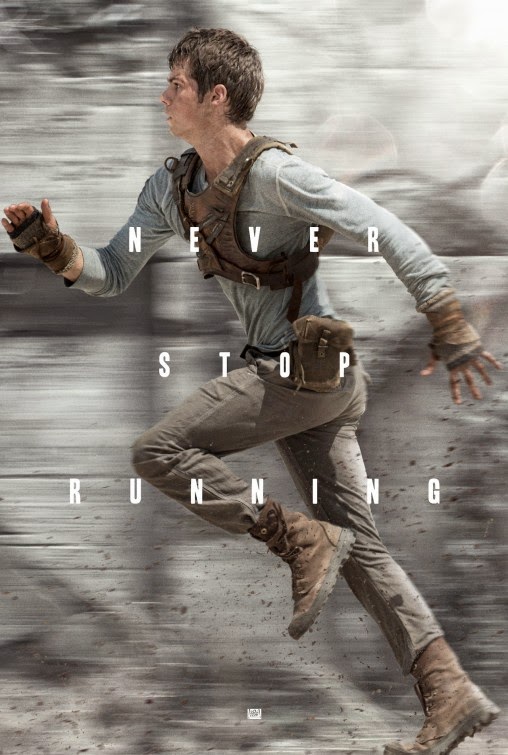
The poster for The Maze Runner inspired me for my Teaser poster as we both used the same effect (motion blur) in the posters. As you might be able to notice, the background of The Maze Runner poster is slightly blurred as if in motion or as if the character was running really fast. I really liked the use of this effect on my own teaser poster as I thought it gave it a cinematic effect to it and looked as it the spell that the character was using was of some force.
 |
| The Maze Runner teaser poster |
This is one of the many posters for Harry Potter and the Deathly Hallows Part 2. This was one of my primary inspirations for my teaser poster. Even though there is some differance from this poster from my teaser poster, like the framing of the character, this was my primary inspiration.
 |
| Haar Potter & The Deathly Hallows: Part 2 poster |
I am quite proud of my teaser poster as I have never made one before. I took a still from my film and then added a little bit more special effects in o make it look more cinematic. I have added in more sparks from the wand and have added a motion blur in the bakground to also give it a cinematic feel. The text and box was inspired from a picture on the Divergent Film Series's Instagram account. I have taken elements from all three posters and have included them in my own poster.
 |
| My teaser poster |
This is my main poster. I really liked the idea of the character reading a book in this poster as that is what the whole idea of the film is about, encouraging children to read. I also really liked the idea of something magical coming out of the book. I tried, in previous drafts of the poster things such as light rays and spells, but in the end I settled with the little 'magical orbs'. I think this adds a nice effect to the poster and makes it look more intruiging.
 |
| My main poster |


