Showing posts with label poster analysis. Show all posts

Monday, 30 March 2015

What Has Inspired Me - Posters

There have been many posters that have inspired me. I particulally liked the Mockingjay teaser poster in which we only see Katniss's back. I liked the minimalism about it and would like to incorporate that into my own poster, possibly a sillhouette of one or both of the main characters and hints of each story intertwined somehow into either the background or amongst the character/s.

I also like the way the Mockingjay poster doesn't even have the title of the film, just the symbol. I have incorporated this into my own film where I have just the lighning bolt underneath my teaser poster; which acts as a symbol for the film.

Mockingjay Teaser poster
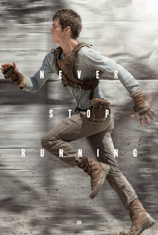
The poster for The Maze Runner inspired me for my Teaser poster as we both used the same effect (motion blur) in the posters. As you might be able to notice, the background of The Maze Runner poster is slightly blurred as if in motion or as if the character was running really fast. I really liked the use of this effect on my own teaser poster as I thought it gave it a cinematic effect to it and looked as it the spell that the character was using was of some force.
 
The Maze Runner teaser poster
This is one of the many posters for Harry Potter and the Deathly Hallows Part 2. This was one of my primary inspirations for my teaser poster. Even though there is some differance from this poster from my teaser poster, like the framing of the character, this was my primary inspiration.
 
Haar Potter & The Deathly Hallows: Part 2 poster
I am quite proud of my teaser poster as I have never made one before. I took a still from my film and then added a little bit more special effects in o make it look more cinematic. I have added in more sparks from the wand and have added a motion blur in the bakground to also give it a cinematic feel. The text and box was inspired from a picture on the Divergent Film Series's Instagram account. I have taken elements from all three posters and have included them in my own poster.
 
My teaser poster
 This is my main poster. I really liked the idea of the character reading a book in this poster as that is what the whole idea of the film is about, encouraging children to read. I also really liked the idea of something magical coming out of the book. I tried, in previous drafts of the poster things such as light rays and spells, but in the end I settled with the little 'magical orbs'. I think this adds a nice effect to the poster and makes it look more intruiging.

My main poster
 

Monday, 19 January 2015

The Hunger Games, Catching Fire and Mockingjay Part 1 Poster Analysis

On this post I will be analysing 5 posters from The Hunger Games Franchise. The first poster is from the second Hunger Games film, Catching Fire.
 
This is one of the many posters used for the marketing and promemotion of The Hunger Games: Catching Fire. It is similar in the styles of some character portaits that were released later on in the marketing campaign. It has a painting-like texture and cracks are even visible on the poster. It has the main character slightly off center and she is holding her iconic bow along with an arrow. The clouds are forming 'wings' behind her, which give her a heroic stance, as in the film she is the peoples hero, thier Mockingjay.

 
This was the first teaser poster for Katniss for The Hunger Games: Mockingjay Part 1. The darkness of the poster reflects the tone of the film and the 'wing' like armor symbolises the Mockingjay, a pivitol symbol throughout all three books and films. As this is a teaser poster, only a tag line 'I am. I will' and the release date has been revealed, but as this is now a very well know franchise, the name of the film is not needed, as the film is also recognisable from the Mockingjay symbol and Katniss's iconic hair braid and archery gear.


This poster was one of the first released for the first Hunger Games films. The poster depicts the Mockingjay pin that Katniss is given within the first film, and here it is presented engulfed in flames. This has major symbollic meaning with the film as both fire and the Mockingjay have occurances and meaning throughout all of the books and films.

Sunday, 18 January 2015

Harry Potter Poster Analysis

This poster is for the first Harry Potter film, Harry Potter and the Philosophers Stone. The actor Daniel Radcliffe is placed in the center of the poster, suggesting to the audience that he is the main character in this film. Surrounding him are several other important charaters and important objects from the film and also locations included within the film. The characters are wearing school uniform which suggests to the audience that the events of a film takes place at a school of some sort. The owl, candles and castle in the background are connotations of magic and wizardry. Also, fog is surround all of the characters and objects within the poster, suggesting that the world that we are about to go into is mysterious and dark, nine like we have ever before seen. The tag line for the film reads 'Journey beyond your imagination', suggesting to the audience that this is a magical world filled with imaginative ideas, targeted toward the younger audience. The title of the film is also central to the poster. The yellow colouring of the text draws the readers eyes to the poster as it is a stark difference from the blue colourisation of the background.


This is a poster for the 4th Harry Potter film, Harry Potter and the Goblet of Fire. The colours within this poster is noticably darker than the first poster, as within the Harry Potter series the narrative gets darker as the audience grows with the films. The main character is sized the largest within the poster and other main characters are positioned behind him, informing the audience of his role within the films. The tag line of this film is "Dark and terrible times lie ahead", and with our characters wands in view, this suggests that this film includes danger as a wand is a form of protection for a wizard or witch, and the darkness of the sky and the darkness of the poster also accentuates the danger. Hogwarts can be seen in the background, and further in the foreground we can see a lake with three audience stands visible. This foreshadows the events within the film.


This is one of the last posters of the Harry Potter franchise. I really like how dark the posters and the feel of the films have gotten and really like the use of fire ember in the foreground of the poster surrounding the characters and the title. The fire like embers suggest that destruction could be a theme within this film, or fire. This poster shows the three main characters running from something, but the audience are not sure what they are running from, thus surrounding it with mystery. In the foreground, the audience can tell that the characters are in a forest of some sort, which is different from the usual background of Hogwarts, suggesting that the narrative of this film has forced the characters to go out of their comfort zone and into a completely different environment, also connoting danger by the darkness of the forest. The tag line of this film is 'The end begins' suggesting that the characters times are almost up, and also signifying the end of the worlds most successful franchise ever, which also plays with the audiences emotions as most of them would have grown up with the characters form the books and the films, and now it is all ending.


I'm not going to to analyse this poster, but I really liked the idea of a moving poster. I am not sure of how I would achieve a moving poster, but I thought that it is a very good way to grab people attention towards both the poster and the film. 


Thursday, 15 January 2015

The Maze Runner Poster Analysis

The Most of the posters for the Maze Runner films are dark and desaturated in appearance. This may be because of the audience that The Maze Runner is targeting. As TMR is a Young Adult fiction book, and is under the dystopian genre, the posters are reflecting the dark times that entail within a dystopian based society. 


The first poster is showing a small segment of the Maze and a character jumping mid air across a gap in the Maze. With the character positioned in the middle of the poster, and in the middle of the air, this heightens the emotion and feel of danger that could be present within the film. The Maze itself is shadowed and is clouded in darkness, suggesting to the audience that the Maze is mysterious and could also hint that the Maze in the antagonist within the film. The canted angle of the shot of the poster also suggests to the audience that the Maze, or the character is not as it seems. A canted angle also suggests abnormalities with people's sanity/mind, and if people have watched the film, we would know that this is true. The title of the film is then placed at the bottom centre of the poster. 


This is the second poster that I have chosen to analyse. Although the there were round about 10 posters released for The Maze Runner, I feel like the ones I have chosen best represent the feel of the film. This one is a full length body poster of the main character Thomas. Here, he is in a mid shot running pose with the text "Never stop running" in the foreground which makes the audience question themselves, 'running from what?'. The background is blurred, suggesting to the audience that Thomas is running at a high speed, linking in with the text displayed in front of him and with the name of the film itself. Specks of dirt and debris can also be seen near the ground and near his hands. Through the clothes that Thomas is wearing, the audience can tell that his is a slightly different world/way of life than ours. The expression in Thomas's face also makes the audience feel like whatever he is running from is dangerous. 


The third and final poster that I will be analysing is of a mid length body shot of one of the main characters called Newt. His body is slightly turned away from the audience suggesting that he doesn't want to show his full character/personality or perhaps he has a side that other don't want to see or mcould be dangerous. He is wearing clothes similar to Thomas, ragged, brown and leathery in texture, suggesting that they are from the same place. In the background of the poster, the audience can see the Maze in much clearer view. It is foggy and dark which leads the audience to believe that it is mysterious and evil. Newt is also holding some sort of knife, suggesting that he is either a dangerous character or that he needs it to protect himself, which leads to the question, 'what is he protecting himself from?'. Even though this poster in in Spanish, underneath the title The Maze Runner, is says 'Based on no.1 best seller' allowing the audience to see that it has been very successful as a book, which may influence them to read the book before watching the film, and also allows the fans of the books to learn about the film, giving the film an inherited audience. 


HOW THIS HAS INSPIRED ME 

Looking at TMZ posters has inspired me. I might use some the the techniques such as using darkness and fog to create mystery within my poster and might also use the idea of just having text in the foreground of my poster.