Showing posts with label media. Show all posts

Monday, 4 May 2015

Evaluation - Question 4

How did you use media technologies in the construction and research, planning and evaluation stages?


After Effects
 The different Media technologies that I used were Adobe Photoshop, Adobe Premiere and Adobe After Effects. I had never really used After Effects to the extent that I had before making this film, so I had to learn a lot. I gained most of my knowledge by messing around on the program, but also through Youtube tutorials and teachers at my school. I found it quite difficult and time consuming at first, but after I was familiar with the program, my confidence grew and it took me a shorter amount of time to make the effects that I wanted within my film. I created my own special effects within After Effects and also created spells effects using pre-made stock footage. The spell effects that you can see in the GIF below was one that I created in After Effects without using stock footage.
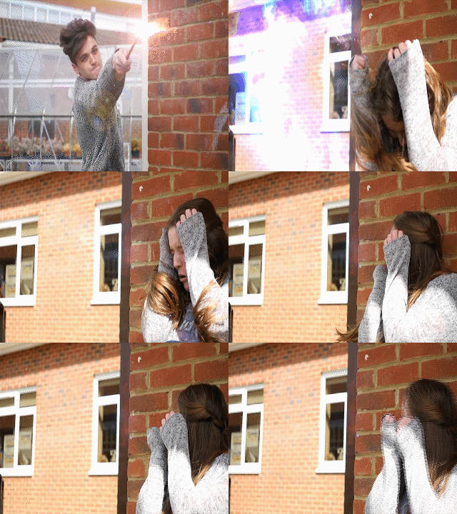
 The process of making a spell effect took me a while to do, but after I had done it a few times I was able to experiment with it and change colours as to how I wanted it; I then applied it to my composition and I had a spell. An example of this is shown in the GIF. For a typical spell, I would use a lens flare, a spell I had created or a stock footage spell and then I would layer different compnents such as duct hits and smoke to make it look more magical and to give the effect more depth. I then had to make out certain things, such as the wall and my arm so it looked like the spell was behind me rather than inforn of me. This also gave the spell effect more believability. I am quite happy with how the effetcs turned out in After Effects considering I have never done anything in After Effects before. I also believe that it has made a great impact on my film and has helped the film and genre come to life.


 Photoshop

I was quite familiar with Adobe Photoshop before making my film, and I felt quite confident with using it. I made all of my posters (my main theatrical poster and two teaser posters) for my film on Photoshop. I learned how to make my posters look much more cinematic, I did this by using a blur effect called 'motion blur' and this allowed me to make my posters look much more cinematic (although I only used this effect on my teaser poster and not my main poster). I experimented with different designs for the main poster, one of which included a book as the main focus on the poster. The book was central to the poster in a portrait layout. The book had rays of light coming out of the pages to make it look more mmagical, but after a while of designing and altering the poster, I
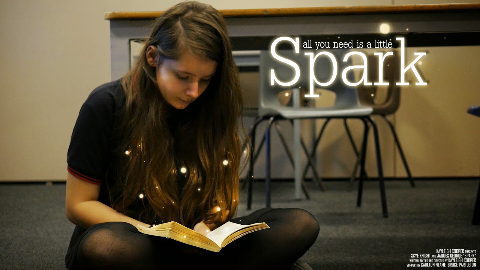
decided that it didn't look right and decided to take a screenshot from the film and use that for my poster instead. With the final poster, I experimented with how I could make this look magical and how it would link to my film without giving too much away. I finally decided that having the little balls of light coming from the book made the poster feel magical without giving too much of the plot of the film away. I looked at similar posters that were within the same fanatsy genre and they all had some
sort of magical and fantastical element to it. The credits for my film are located in the bottom right hand corner of the film poster. Most cinematic film posters have this central along with the title, but I felt that this wasn't a good place to have my title as it would have covered the book, which is what I wanted the audience to focus on.


Premiere Pro 
I was very familiar with using Adobe Premiere when I was making my film, so I knew the basics of the program. By making this film, it allowed my to exersize my skills and to be more familiar with the program. When making this film, it also allowed my to understand the different exporting options available to me and what the best exporting option was for my film. Premiere allowed me to figure out where I wanted my clips to be and really helped with how I wanted to structure my film. Having used Premiere before, I knew all the basics, but this time I played around with some of the 'in-house' effects that are within the Premiere program, such as Warp Stabiliser and many other presets, video tansitions, video effects, audio transitions and audio effects. The use of Warp Stabiliser allowed me to correct an unstable shot if it was a little bit wobbly. I didn't use many video transitions within my film as many of the transitions were cut hard/sharp cuts to black, which I thought were very effective for the narrative and plot.

Tuesday, 28 April 2015

Evaluation - Question 1

In what ways does your media product use, develop or challenge forms and conventions of real media products?


Narrative & Opening

The film starts off with a slow tracking shot of one of the main characters sitting down and reading Harry Potter. The tracking into the character suggests to the audience that she is pivotal to the plot/narrative of the film. The shot then changes to a  close up of the book that she is reading. To the eagle eyed audience, they will be able to tell that the book is Harry Potter and the Philosopher's Stone. I liked the idea of including the book at the beginning of the film, but not excplicitly telling the audience what the book is, so just a chapter header is seen 'The Journey To Platform Nine and Three-Quarters'. The shot after that is of the characters eyes reading.
The audience can then clearly see that her imagination is captured by the book. Her eyes are also moving as she is reading the page. I really liked the idea of having a close up of the eyes within the opening of the film as eyes are often seen as 'the window to the soul' and the audience can clearly tell that the girl is enjoying reading. The setting indicates to the audience that she is in a school, and her costume also tells the audience this as well.

Camera Work & Editing
In the scene where the girl confronts the boy for stealing her book, there are close-ups of the two characters faces, suggesting some sort of confrontation between the two, but also suggesting that they are equals and that they are both equally able of the same things. I thought that the two close-ups were vital for the film as it shows the audience that the characters are strong and are not afraid to stand up for themselves, which I think for a film that is shown to young children, is necessary.  In the scene that follows, frenetic editing is used to show the fast-paced action; this is when  they have the wand fight in the courtyard. This shows the audience the magic within the film, but it is not until later on in the film that they discover that it was all in their heads. In the last part of the wand fight scene, the two characters take their battle inside to which the boy casts a spell and the girl crouches down to protect herself. The low angle of her crouching down and with her arms up shielding her face portrays her to the audience as venerable and scared. A shot of the character when she is grown up (in the second part of the film) is also used that is similar. This shot is used when the older boy casts a similar spell at her and she again shields her face using her arms whilst crouching down. The slight low angle in this shot portrays her in danger and distress, but it is only seconds later that the audience discover that it is all a game. The camera work in part two of the film is still quite frenetic when the second wand fight occurs, but his all changes in the third part of the film when the camera-work is slow and paced, reflecting calmness.
This GIF shows the type of editing and the pace of the editing within my film. The editing had to be quite fast to keep up with the pace and timing of the spell special effect, so if the editing wasn't as fast paced, the spell special effects wound not have worked as well..

Sound

In the opening of the film, an eerie yet magical non-diegetic sound can be heard; this track is 'The Journey Begins' which I found on the Youtube Audio Library (which is royalty and copyright free). I thought that this was a good piece of music to start with as it sounds fantastical and the title of the piece reflects their journey just beginning. The last piece of music 'Your One Life' by Adens Sky is a really good piece of music to end on (in my opinion). It is uplifting and makes the audience feel emotional and really brings out the truth and reality with the visuals that they are seeing on screen. I found some royalty and copyright free spell sound effects of Youtube and used them for the spell sound effects within my film. I thought that they gave the spells much more of a fantasy element to it and alongside the special effects, really made the film come alive.
 
I recorded extra audio that has been used that the end of the film. The audio that was picked up on the camera was so clear that I just used the raw audio file from the recorded video and didn't have to adda ny effects on afterwards. There were a few clips of audio that picked up traces of wind when we were filming outside, but i managed to remove this in Adobe Audition, which is an audio editing software. After a few trial and erros on correcting the sound, I finally found a tutorial on Youtube that pointed me in the right direction to get rid of the wind within the audio clip.


Distributors

The distributors for this film is my own film company, Firebird Films. The logo has changed from the last time it was used and has been updated from the last due to the progress in my abilities to use Photoshop and After Effects. because this project is really personal to me, I felt that using another film distributors company would take away the message of the film, whereas if an audience see's a company that they have never seen before, they would think that it is a more independent film, therefore makes it a more personal film.

Direct Comparisons To Other Films Within The Fantasy Genre

Here are some shots that compare both my film to other fantasy films. The fist shot in Harry Potter reflects the shot in my film. In the scene in Harry Potter, he is confronting Voldemort and within the scene in my film, the girl is confronting the boy. Although the shot in my film is more of a close up, there still is a resemblance between the shots.
 The next two shots are a comparison of the Harry Potter teaser poster and the shot that I used for my teaser poster. They are quite similar, except from the shot angle. I really wanted to include a shot like this within my film as it made my character look stong and powerful.
The next two shots are stills from Harry Potter and the Goblet of Fire and my film Spark. These two are very much the same and I like how they are very similar.
The one thing that I have noticed within these comparisons is that te colour pallette within the Harry Potter stills have a blue/green pallette to them whilst my film has a much warmer feel. The reason for the cold feel in Harry Potter could possibly be because the screenshots were from later films int the franchise meaning that the narrative would be much darker as the audience has grown up with the film, whereas my film has a much warmer feel because it's the first one and appeals to a younger audience than the last HP films would have.


Title Design & Inspiration
 
All of the films that included some sort of magic or fantasy within the narrative/plot, have some sort of 'light' within their titles, so that is what I wanted to re-create. The Hobbit title served as most of the inspiration as I really liked the way the light came through the text. This is what I wanted to re-create. Whilst the Hobbit title unfolds, my titles get pulled back together after an implosion. I experimented with how I wanted my titles to appear on screen. I fist designed them to fade out of blackness with the light shining through them, them explode into tiny fragments of light. I then reversed this so the tiny pieces of light get pulled back together and the
text fades back into darkness. This is how the titles look now. I really liked how the title explodes as it gives it an even more fantasy-like feel and draws the audience in. I also really like the colour of it; as the gold also makes it feel fantastical, almost like The Hobbit titles.


Monday, 30 March 2015

What Has Inspired Me - Posters

There have been many posters that have inspired me. I particulally liked the Mockingjay teaser poster in which we only see Katniss's back. I liked the minimalism about it and would like to incorporate that into my own poster, possibly a sillhouette of one or both of the main characters and hints of each story intertwined somehow into either the background or amongst the character/s.

I also like the way the Mockingjay poster doesn't even have the title of the film, just the symbol. I have incorporated this into my own film where I have just the lighning bolt underneath my teaser poster; which acts as a symbol for the film.

Mockingjay Teaser poster
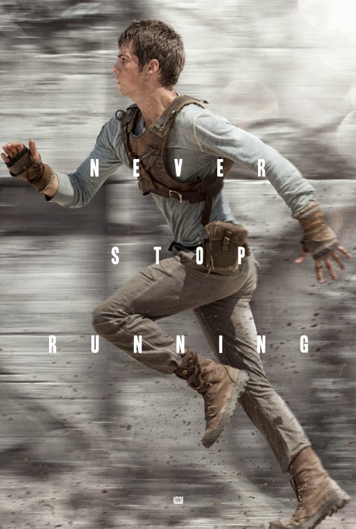
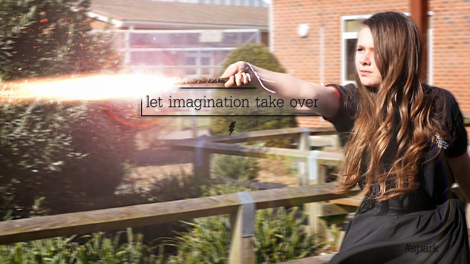
The poster for The Maze Runner inspired me for my Teaser poster as we both used the same effect (motion blur) in the posters. As you might be able to notice, the background of The Maze Runner poster is slightly blurred as if in motion or as if the character was running really fast. I really liked the use of this effect on my own teaser poster as I thought it gave it a cinematic effect to it and looked as it the spell that the character was using was of some force.
 
The Maze Runner teaser poster
This is one of the many posters for Harry Potter and the Deathly Hallows Part 2. This was one of my primary inspirations for my teaser poster. Even though there is some differance from this poster from my teaser poster, like the framing of the character, this was my primary inspiration.
 
Haar Potter & The Deathly Hallows: Part 2 poster
I am quite proud of my teaser poster as I have never made one before. I took a still from my film and then added a little bit more special effects in o make it look more cinematic. I have added in more sparks from the wand and have added a motion blur in the bakground to also give it a cinematic feel. The text and box was inspired from a picture on the Divergent Film Series's Instagram account. I have taken elements from all three posters and have included them in my own poster.
 
My teaser poster
 This is my main poster. I really liked the idea of the character reading a book in this poster as that is what the whole idea of the film is about, encouraging children to read. I also really liked the idea of something magical coming out of the book. I tried, in previous drafts of the poster things such as light rays and spells, but in the end I settled with the little 'magical orbs'. I think this adds a nice effect to the poster and makes it look more intruiging.

My main poster
 

Thursday, 26 March 2015

Creating Spells With Lens Flares & Stock Footage In After Effects

For one version of the spells used in my film I used lens flares and stock footage. Here is how I created them.

I first went to the Generate tab at the top of the screen and then went to the Lens Flare tab. I then selected what Lens Flare I wanted and then added it to my timeline. I have added many Lens Flares to my composition and after editing , masking, and key framing all of the ones that I want, I have ended up with something like this.


I has taken a while to do, but I am very proud of my final product. The lens flares serve as a 'spell' and I think look really effective.

An example of a Lens Flare


Here is what an example of a Lens Flare looks like on my project.


Thursday, 22 January 2015

Screenplay For Film | Draft 1

SCENE 1

INTERIOR – CLASSROOM G28?

Inside a classroom the children are playing and doing what they like, a reward time has been given. Most of the children are on their tablets playing various games. Chatter and exclamations from children can be heard. GIRL is sitting on the floor reading Harry Potter, along with a large pile of books beside her. She is engrossed in reading the books and is oblivious to the other children around her. BOY comes over and starts a conversation.

BOY:

What are you doing?


GIRL

Reading…


BOY

Don’t you want to play Minecraft? We’re all going on a quest together. You see we need to get this special object, and we need the object to level up and unlock more stuff. And then with the stuff we will be able to unlock means we can level up faster.


GIRL is still very engrossed into her book.


GIRL

(Dreamily) Maybe some other time


BOY

(Sighs) You’re so boring…


GIRL takes no notice. BOY then quickly snatches the book from her hands and runs out of the classroom.


GIRL

HEY!


They both run through the corridors and out into the Peace Garden.


EXTIRIOR – PEACE GARDEN

GIRL

Hey! Give me that back!


BOY

Or what?


GIRL sees a stick lying on the floor and picks it up.


BOY

What are you going to do? Throw a stick at me?


GIRL

This isn’t a stick…


The stick then turns into a wand. BOY, obviously up for the confrontation, grabs himself a stick and his turns into a wand also. The two share a tense moment. Then all of a sudden GIRL throws a spell at him, but BOY manages to deflect it. Both are surprised and amazed at their new abilities and smile wildly. They both then continue to cast spells towards each other but also having fun at the same time, laughing. BOY then casts one final spell and it hits GIRL and she shields herself and closes her eyes.


SCENE 2

EXTERIOR – FIELD

GIRL opens her eyes and sees that she is in a field and that she is wearing different clothes. She realises that she is in The Hunger Games.


GIRL (to herself)

I haven’t read The Hunger Games yet…


GIRL looks over towards BOY, he look guilty.


BOY

I only read a bit… What?! Why do you get to have the bow?


GIRL looks down and sees that she is carrying a bow. She rolls her eyes and she hands it to BOY. He looks pleased.


BOY

Oh yeah…


In the distance, a scream can be heard and dogs howling and snarling. A canon goes off. Both BOY and GIRL turn round, scared.


BOY (whispers)

Mutts… RUN!


They both start to run.


GIRL

I thought you said you only read a bit of it!


BOY

I LIED!


As BOY and GIRL are running, the pass through trees and then are transported into The Maze.


SCENE 3

EXTIRIOR – FIELD

BOY and GIRL come to a sudden stop after running. They notice that they are wearing different clothes from before and BOY doesn’t have his bow. Both BOY and GIRL are panting heavily from the run.


BOY (nervously)

Where are we now?


GIRL

We’re in the Maze


BOY

The what?


GIRL

The Maze! Grievers… that means there’ll be –


A strange roar-like noise is heard coming from the Maze. BOY and GIRL look terrified.

BOY

What was that?!


GIRL

Just follow me, and run like your life depends on it


BOY

But I’m scared


GIRL

If you aren’t scared…


BOY

You ain’t human…


GIRL smiles, and they both begin to run, again, into the Maze.


SCENE 4

INTERIOR – WARDROBE/ROOM


BOY and GIRL fall out of wardrobe. They look bewildered. They both stand up and realise that they are back in their school uniform. As they leave the room in which the wardrobe was in, snow drift out from the wardrobe door and the faint noise of a lions roar can be heard.


INTERIOR – HALLWAY

The both enter the hallway, seemingly disappointed that there is no magic universe to be found.


BOY

I’m sorry I took you book from you…


GIRL

That’s alright. I really like your necklace by the way.


BOY is wearing the One Ring. They both smile. A TEACHER steps outside from a classroom. BOY and GIRL turn round, startled.


TEACHER

I thought I told no one to leave the room! Come back in please.


Both BOY and GIRL go back into their classroom and GIRL finds that her books are in the pile that she left, including the one BOY took from her.


BOY

What shall we do now?


GIRL takes out LORD OF THE RINGS from her bag and hands it to BOY. He seems delighted. GIRL picks up HARRY POTTER and they both begin to read.

THE END


POSSIBLE VFX IDEAS

·         The One Ring glows red and then the film ends, suggesting that the BOY is about to be transported into LOTR.

Monday, 19 January 2015

Target Audience

The target audience for my film will be children, both boys and girls, aged 11 and upwards. I thiught that that use of well known childrens books, such as Harry Potter and Narnia, would grab their attention as they are both books and films and are also well known franchises. I have included older  reading books, such as The Hunger Games, The Maze Runner and Divergent to act as a transition from childrens books into more Young Adult books (YA). This also serves as a tranition into Secondary school, and this mirrors the childrens books into YA books.

I thought the the VFX used within my film will capture my audiences imagination and encourage them to read the books and watch the films. As I will have the books of each film used as props within my film, I thought that this would encourage my audience to read the books more than the film as they can see the books visually, which could also act as a visual devide or subliminal message.

I also thought that with the fast tempo of the film, this would grasp thier attention and would hopefully engross thier attention into the world of the books in which they are watching. Also, the premise of the children actually being in the world of the books would also encourage them to do the same in thier imagination.

The Hunger Games, Catching Fire and Mockingjay Part 1 Poster Analysis

On this post I will be analysing 5 posters from The Hunger Games Franchise. The first poster is from the second Hunger Games film, Catching Fire.
 
This is one of the many posters used for the marketing and promemotion of The Hunger Games: Catching Fire. It is similar in the styles of some character portaits that were released later on in the marketing campaign. It has a painting-like texture and cracks are even visible on the poster. It has the main character slightly off center and she is holding her iconic bow along with an arrow. The clouds are forming 'wings' behind her, which give her a heroic stance, as in the film she is the peoples hero, thier Mockingjay.

 
This was the first teaser poster for Katniss for The Hunger Games: Mockingjay Part 1. The darkness of the poster reflects the tone of the film and the 'wing' like armor symbolises the Mockingjay, a pivitol symbol throughout all three books and films. As this is a teaser poster, only a tag line 'I am. I will' and the release date has been revealed, but as this is now a very well know franchise, the name of the film is not needed, as the film is also recognisable from the Mockingjay symbol and Katniss's iconic hair braid and archery gear.


This poster was one of the first released for the first Hunger Games films. The poster depicts the Mockingjay pin that Katniss is given within the first film, and here it is presented engulfed in flames. This has major symbollic meaning with the film as both fire and the Mockingjay have occurances and meaning throughout all of the books and films.

Sunday, 18 January 2015

Harry Potter Poster Analysis

This poster is for the first Harry Potter film, Harry Potter and the Philosophers Stone. The actor Daniel Radcliffe is placed in the center of the poster, suggesting to the audience that he is the main character in this film. Surrounding him are several other important charaters and important objects from the film and also locations included within the film. The characters are wearing school uniform which suggests to the audience that the events of a film takes place at a school of some sort. The owl, candles and castle in the background are connotations of magic and wizardry. Also, fog is surround all of the characters and objects within the poster, suggesting that the world that we are about to go into is mysterious and dark, nine like we have ever before seen. The tag line for the film reads 'Journey beyond your imagination', suggesting to the audience that this is a magical world filled with imaginative ideas, targeted toward the younger audience. The title of the film is also central to the poster. The yellow colouring of the text draws the readers eyes to the poster as it is a stark difference from the blue colourisation of the background.


This is a poster for the 4th Harry Potter film, Harry Potter and the Goblet of Fire. The colours within this poster is noticably darker than the first poster, as within the Harry Potter series the narrative gets darker as the audience grows with the films. The main character is sized the largest within the poster and other main characters are positioned behind him, informing the audience of his role within the films. The tag line of this film is "Dark and terrible times lie ahead", and with our characters wands in view, this suggests that this film includes danger as a wand is a form of protection for a wizard or witch, and the darkness of the sky and the darkness of the poster also accentuates the danger. Hogwarts can be seen in the background, and further in the foreground we can see a lake with three audience stands visible. This foreshadows the events within the film.


This is one of the last posters of the Harry Potter franchise. I really like how dark the posters and the feel of the films have gotten and really like the use of fire ember in the foreground of the poster surrounding the characters and the title. The fire like embers suggest that destruction could be a theme within this film, or fire. This poster shows the three main characters running from something, but the audience are not sure what they are running from, thus surrounding it with mystery. In the foreground, the audience can tell that the characters are in a forest of some sort, which is different from the usual background of Hogwarts, suggesting that the narrative of this film has forced the characters to go out of their comfort zone and into a completely different environment, also connoting danger by the darkness of the forest. The tag line of this film is 'The end begins' suggesting that the characters times are almost up, and also signifying the end of the worlds most successful franchise ever, which also plays with the audiences emotions as most of them would have grown up with the characters form the books and the films, and now it is all ending.


I'm not going to to analyse this poster, but I really liked the idea of a moving poster. I am not sure of how I would achieve a moving poster, but I thought that it is a very good way to grab people attention towards both the poster and the film. 


Thursday, 15 January 2015

The Maze Runner Poster Analysis

The Most of the posters for the Maze Runner films are dark and desaturated in appearance. This may be because of the audience that The Maze Runner is targeting. As TMR is a Young Adult fiction book, and is under the dystopian genre, the posters are reflecting the dark times that entail within a dystopian based society. 


The first poster is showing a small segment of the Maze and a character jumping mid air across a gap in the Maze. With the character positioned in the middle of the poster, and in the middle of the air, this heightens the emotion and feel of danger that could be present within the film. The Maze itself is shadowed and is clouded in darkness, suggesting to the audience that the Maze is mysterious and could also hint that the Maze in the antagonist within the film. The canted angle of the shot of the poster also suggests to the audience that the Maze, or the character is not as it seems. A canted angle also suggests abnormalities with people's sanity/mind, and if people have watched the film, we would know that this is true. The title of the film is then placed at the bottom centre of the poster. 


This is the second poster that I have chosen to analyse. Although the there were round about 10 posters released for The Maze Runner, I feel like the ones I have chosen best represent the feel of the film. This one is a full length body poster of the main character Thomas. Here, he is in a mid shot running pose with the text "Never stop running" in the foreground which makes the audience question themselves, 'running from what?'. The background is blurred, suggesting to the audience that Thomas is running at a high speed, linking in with the text displayed in front of him and with the name of the film itself. Specks of dirt and debris can also be seen near the ground and near his hands. Through the clothes that Thomas is wearing, the audience can tell that his is a slightly different world/way of life than ours. The expression in Thomas's face also makes the audience feel like whatever he is running from is dangerous. 


The third and final poster that I will be analysing is of a mid length body shot of one of the main characters called Newt. His body is slightly turned away from the audience suggesting that he doesn't want to show his full character/personality or perhaps he has a side that other don't want to see or mcould be dangerous. He is wearing clothes similar to Thomas, ragged, brown and leathery in texture, suggesting that they are from the same place. In the background of the poster, the audience can see the Maze in much clearer view. It is foggy and dark which leads the audience to believe that it is mysterious and evil. Newt is also holding some sort of knife, suggesting that he is either a dangerous character or that he needs it to protect himself, which leads to the question, 'what is he protecting himself from?'. Even though this poster in in Spanish, underneath the title The Maze Runner, is says 'Based on no.1 best seller' allowing the audience to see that it has been very successful as a book, which may influence them to read the book before watching the film, and also allows the fans of the books to learn about the film, giving the film an inherited audience. 


HOW THIS HAS INSPIRED ME 

Looking at TMZ posters has inspired me. I might use some the the techniques such as using darkness and fog to create mystery within my poster and might also use the idea of just having text in the foreground of my poster. 

Tuesday, 6 January 2015

Thursday, 18 December 2014

Locations & Props That Will Be Used

REALITY

   Props
  • Harry Potter book
  • The Hunger Games book
  • The Maze Runner book
  • Divergent book
  • Narnia book
   Locations
  • School grounds
  • Class room
  • School corridors

HARRY POTTER

   Props
  • Two wands
   Locations
  • School grounds
  • Classroom
  • School corridors

THE HUNGER GAMES

   Props
  • Bow and arrows
   Locations
  • Feild/lightly wooded area

THE MAZE RUNNER

   Props
  • N/A
   Locations
  • Feild/lightly wooded area

DIVERGENT

   Props
  • N/A
   Locations
  • N/A (greenscreen)

Thursday, 11 December 2014

Feedback

1. Find a clip for each transition to illustrate each mini sequence.

2. Start reasearching posters for each of the films and analyse them all. What has inspired me? Where is there a common link?

3. I need to start thinking of ideas for my own poster.

Monday, 1 December 2014

Narrative

In this post I will be explaining how my mini stories will flow into one another. I am going to experiment with the use of graphic matches to link each mini story.

Style Inspiration - I have seen a short film in where the background of a shot was removed to reveal a different location so the director could go to two locations in one take. This is something I would like to re-create or at least try to.


REALITY
This is our opening scene. It starts with our main girl sitting down and reading Harry Potter, with The Maze Runner, Narnia, The Hunger Games and Divergent in a pile beside her. Our main boy then comes along and taunts her for reading the book and says that she should be going something more fun, like playing the x-box. When he steals her books, they chase eachother throught the school corridors.


HARRY POTTER
When the young girl confronts the boy in the courtyard, it turns into a wand battle and the run throughout the school casting spells at each other. The boy casts a spell towards the girl and she closes her eyes. This acts as a transition into the next story as when she opens her eyes next, she is in The Hunger Games. This visual device was inspired by La Haine.


THE HUNGER GAMES
The scene starts off with a  close up of the girls eyes. We then see that thier outfits have changed and that both the boy and the girl are outside. After a little exploring, daytime turns to night-time and they hear a canon go of. Then after running from the Mutts (these will only be heard and not seen), a transition swipe running into the trees will transfer them to The Maze Runner.


THE MAZE RUNNER
The transition swipe will transfer the girl and boy into the world of The Maze Runner, and again their clothes have changed. They are then, quite literally, faced with the walls of the Maze and after a bit of contemplating, they finally go inside the Maze. When they walk into the Maze, it will show them walking out of a wardrobe/cupboard, transferring them into Narnia.


NARNIA
As they walk out of the cupboard, they are in their school uniform again. The wardrobe/cupboard has a few flakes of snow drifting out from it and rays of light can be seen, similar to the picture I have posted below in a previous post. When the children leave, a lion roar can be heard from the wardrobe/cupboard.


REALITY
The children walk out from the room where the cupboard/wardrobe was in and they find themselves back in their school. They go and sit back down on their place on the floor where the girl was to start with, and both pick up a book and start reading again. Another boy comes over and asks if they want to play a game on the computer/x-box, and they both politely decline, and continue reading.

Thursday, 13 November 2014

Test Shots - Harry Potter

Here are some test shots that I have made using After Effects. I looked at a few tutorials on how to make them, but after a while found them to be of no use, so I decided to try and do some myself, and this is the result. It took me 4 hours to do, and now that I have gotten used to what I will be doing, it will take much less time. These are only draft shots, so the efects used in the film will hopefully be of better quality and standard, considering this is my first time of using After Effects.