FINAL FILM
FINAL POSTER
FINAL REVIEW

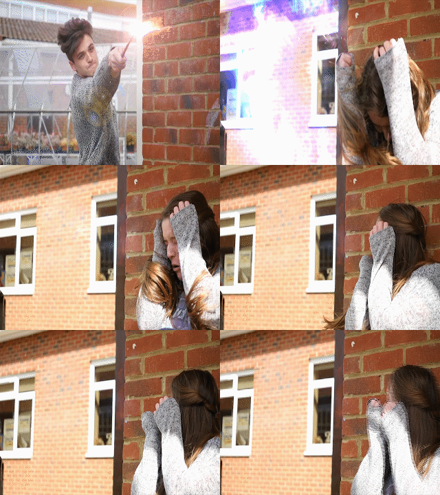
 The process of making a spell effect took me a while to do, but after I had done it a few times I was able to experiment with it and change colours as to how I wanted it; I then applied it to my composition and I had a spell. An example of this is shown in the GIF. For a typical spell, I would use a lens flare, a spell I had created or a stock footage spell and then I would layer different compnents such as duct hits and smoke to make it look more magical and to give the effect more depth. I then had to make out certain things, such as the wall and my arm so it looked like the spell was behind me rather than inforn of me. This also gave the spell effect more believability. I am quite happy with how the effetcs turned out in After Effects considering I have never done anything in After Effects before. I also believe that it has made a great impact on my film and has helped the film and genre come to life.
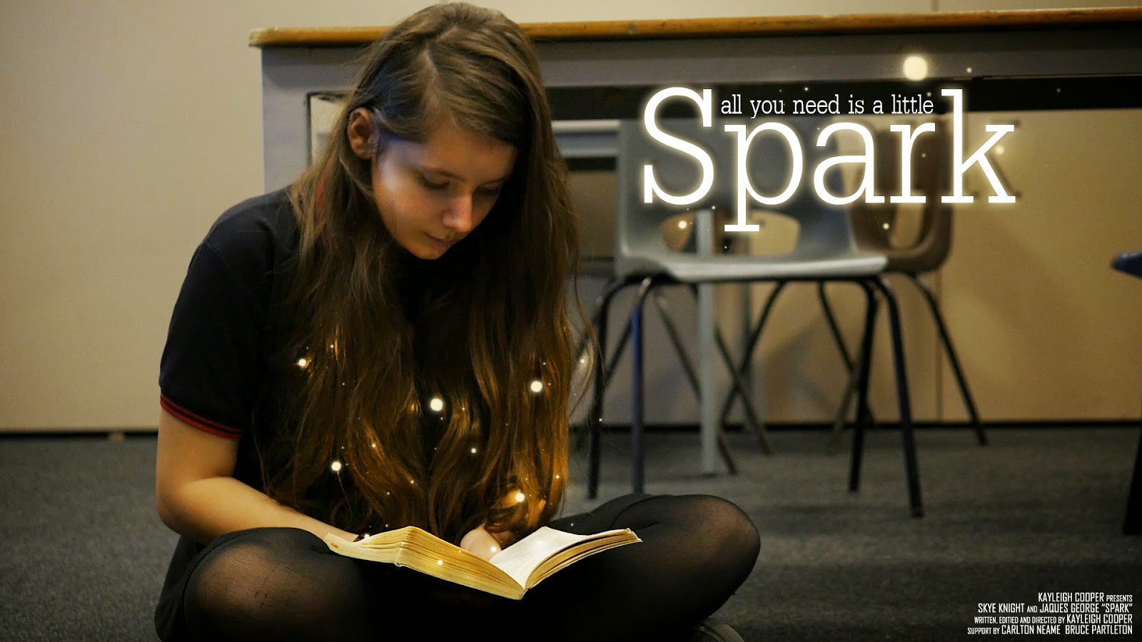
 decided that it didn't look right and decided to take a screenshot from the film and use that for my poster instead. With the final poster, I experimented with how I could make this look magical and how it would link to my film without giving too much away. I finally decided that having the little balls of light coming from the book made the poster feel magical without giving too much of the plot of the film away. I looked at similar posters that were within the same fanatsy genre and they all had some
 sort of magical and fantastical element to it. The credits for my film are located in the bottom right hand corner of the film poster. Most cinematic film posters have this central along with the title, but I felt that this wasn't a good place to have my title as it would have covered the book, which is what I wanted the audience to focus on.
Okay, so I’d like to start off by saying I LOVE the film; one of the best student films I’ve ever seen. In fact it’s so polished that there’s very little to say on the negative side. But anything and everything has room to improve slightly so here we go!
The opening is very intriguing. Though the first shot could have more focus on the girl, as the shot makes me want to focus on the chair in the middle of the frame. When the boy sits down to talk, the music is too loud, or the dialogue is too quiet, but everything can be heard so this is a nit-picky issue. The delivery of the dialogue isn’t fully in-keeping with the music, but that’s more of a note for the actors. At 4:07-4:08, the line “Hey give me my book back” should be heard sooner, there is slightly too large a gap between when the girl stops running and says her line. 4:25, music changes too suddenly, this could have been done in a more seamless manner (maybe the big orchestral music could have started sooner at a much lower volume and slowly increased in volume as the scene’s intensity arose). Not all of the attacks blend into each other; it looks like sometimes the wand is used but doesn’t go anywhere. 5:14, music begins to fade out but comes to a sudden stop, this can be a little jarring. 5:17, goes silent for a second, sounds jumpy. 6:10 more sudden silence, 6:45 takes a while to focus. Title “SPARK” doesn’t stay in focus long enough, it fades out very quickly and we never see it very clearly. I assume “Fran Wallace” was added in later? It’s jittery and a different shade of white but not a real issue.
Now I’ve been super nit-picky here, I think SPARK is absolutely fantastic. Special effects are done really well, my favourite scene is the fight between you and Connor as Bruce walks in. The shots and cuts are perfect as is the timing. I’m glad you use simple cuts instead of all the special fades and cross-cuts and pre-rendered transition nonsense that most student films use; they’re barely ever used professionally and when they are, there’s a real purpose for it. To some extent I wish you were allowed a longer duration as it feels a little rushed due to the duration limit in the course requirements. But it is clear that a lot of time and effort has gone into this film and I BEG you to keep doing this, you’re so talented. Even if you choose a different path you have a knack for film making and should continue to do so, even if they’re just short amateur films. I particularly love the lens flares caused by the wands, very well done.
It's incredibly well shot, brilliant effects! There's not a lot wrong with it apart from perhaps the story? Apart from that it's wonderful!
Good things: Well shot, great effects, the Bruce cameo! Less good bits: The story wasn't obvious until the monologue at the end, some of the shots were over exposed (unless that was the look you were going for???) and the music sometimes over powered peoples voices!
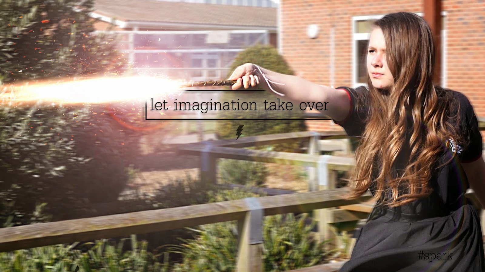
 The poster allows me to show what the film is about without giving my away. The little glowing orbs suggest to the audience that some sort of magic is involved within the narrative, and with the main character reading a book, the audience will know that the film has something to do with reading. The fact that the young girl is wearing a school uniform also suggests to the audience that the film will be set in a school. Although this is the main poster, the teaser posters give much more information away as to the narrative and the plot of the film. They include visuals of the spells being used and a text quote that reflects the overall message of the film.