Wednesday 6 May 2015

Analysis of Empire Magazine Reviews

Here are two examples of reviews that were included in issues of Empire Magazine. Most of the reviews have a similar layout; a main picture to show the reader and a few other smaller images, details about the film such as the director, the screen writer, the actors, the running length and plot. A large quote is also included in both of the reviews and also a star rating at the end of the review.
I would like to include almost all of these things in my review to make it look as professional as it can be. I have based my review on the layout of the Paranormal Activity review, as that is the format and colour of most of the reviews from the Empire magazine.


Both of the reviews have the title of the film that is being reviews in bold, large text across the page and a some text, often comical (a pun) or linked to the film in some way. Underneath that, they then have a brief outline of all of the things that makes the film, such as the release date, the certificate of the film, the director, the actors and a brief synopsis of the film. This is often situated in the mid-left hand corner of the page/review. Each review also has a large quote from the review within the review itself; this is always much more visiable than the text of the review. After the review, the reviewer gives the reader his or her verdict and a rating of the film out of five stars. The language used within the review itself is quite colloquial as it is for an everyday audience/reader.

Monday 4 May 2015

Evaluation - Question 4

How did you use media technologies in the construction and research, planning and evaluation stages?


After Effects
 The different Media technologies that I used were Adobe Photoshop, Adobe Premiere and Adobe After Effects. I had never really used After Effects to the extent that I had before making this film, so I had to learn a lot. I gained most of my knowledge by messing around on the program, but also through Youtube tutorials and teachers at my school. I found it quite difficult and time consuming at first, but after I was familiar with the program, my confidence grew and it took me a shorter amount of time to make the effects that I wanted within my film. I created my own special effects within After Effects and also created spells effects using pre-made stock footage. The spell effects that you can see in the GIF below was one that I created in After Effects without using stock footage.
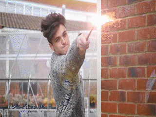
 The process of making a spell effect took me a while to do, but after I had done it a few times I was able to experiment with it and change colours as to how I wanted it; I then applied it to my composition and I had a spell. An example of this is shown in the GIF. For a typical spell, I would use a lens flare, a spell I had created or a stock footage spell and then I would layer different compnents such as duct hits and smoke to make it look more magical and to give the effect more depth. I then had to make out certain things, such as the wall and my arm so it looked like the spell was behind me rather than inforn of me. This also gave the spell effect more believability. I am quite happy with how the effetcs turned out in After Effects considering I have never done anything in After Effects before. I also believe that it has made a great impact on my film and has helped the film and genre come to life.


 Photoshop

I was quite familiar with Adobe Photoshop before making my film, and I felt quite confident with using it. I made all of my posters (my main theatrical poster and two teaser posters) for my film on Photoshop. I learned how to make my posters look much more cinematic, I did this by using a blur effect called 'motion blur' and this allowed me to make my posters look much more cinematic (although I only used this effect on my teaser poster and not my main poster). I experimented with different designs for the main poster, one of which included a book as the main focus on the poster. The book was central to the poster in a portrait layout. The book had rays of light coming out of the pages to make it look more mmagical, but after a while of designing and altering the poster, I
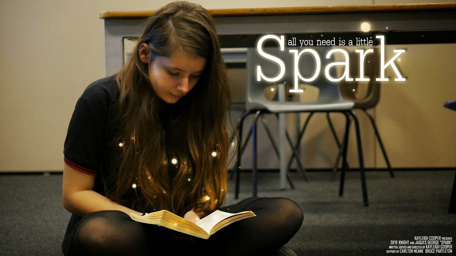
decided that it didn't look right and decided to take a screenshot from the film and use that for my poster instead. With the final poster, I experimented with how I could make this look magical and how it would link to my film without giving too much away. I finally decided that having the little balls of light coming from the book made the poster feel magical without giving too much of the plot of the film away. I looked at similar posters that were within the same fanatsy genre and they all had some
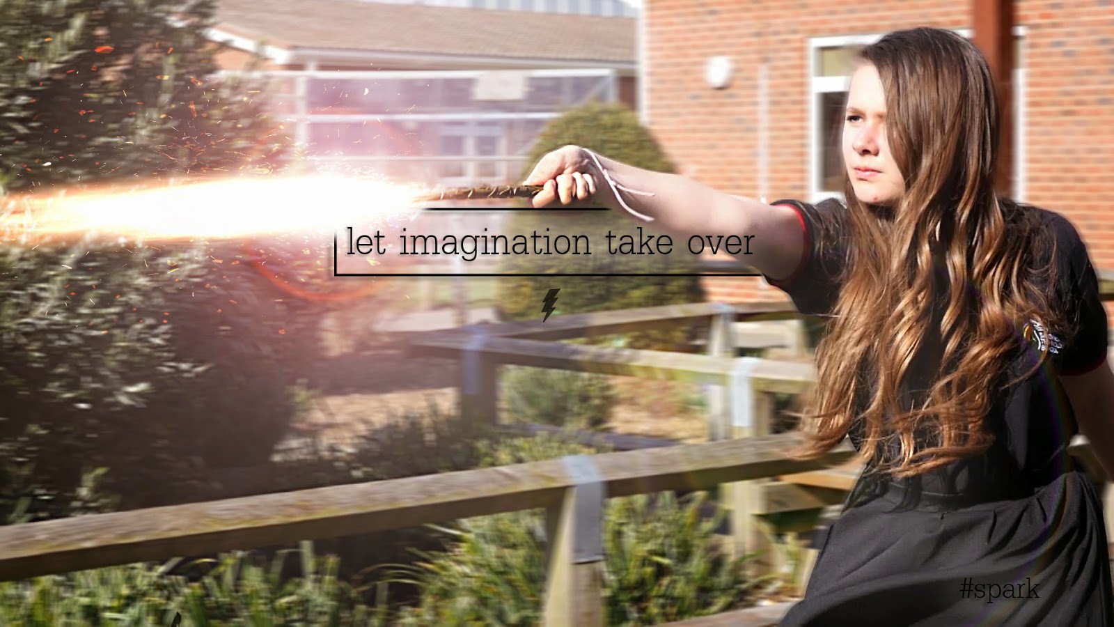
sort of magical and fantastical element to it. The credits for my film are located in the bottom right hand corner of the film poster. Most cinematic film posters have this central along with the title, but I felt that this wasn't a good place to have my title as it would have covered the book, which is what I wanted the audience to focus on.


Premiere Pro 
I was very familiar with using Adobe Premiere when I was making my film, so I knew the basics of the program. By making this film, it allowed my to exersize my skills and to be more familiar with the program. When making this film, it also allowed my to understand the different exporting options available to me and what the best exporting option was for my film. Premiere allowed me to figure out where I wanted my clips to be and really helped with how I wanted to structure my film. Having used Premiere before, I knew all the basics, but this time I played around with some of the 'in-house' effects that are within the Premiere program, such as Warp Stabiliser and many other presets, video tansitions, video effects, audio transitions and audio effects. The use of Warp Stabiliser allowed me to correct an unstable shot if it was a little bit wobbly. I didn't use many video transitions within my film as many of the transitions were cut hard/sharp cuts to black, which I thought were very effective for the narrative and plot.

Sunday 3 May 2015

Evaluation - Question 3

What have you learned from audience feedback?


AUDIENCE FEEDBACK #1
Okay, so I’d like to start off by saying I LOVE the film; one of the best student films I’ve ever seen. In fact it’s so polished that there’s very little to say on the negative side. But anything and everything has room to improve slightly so here we go!
The opening is very intriguing. Though the first shot could have more focus on the girl, as the shot makes me want to focus on the chair in the middle of the frame. When the boy sits down to talk, the music is too loud, or the dialogue is too quiet, but everything can be heard so this is a nit-picky issue. The delivery of the dialogue isn’t fully in-keeping with the music, but that’s more of a note for the actors. At 4:07-4:08, the line “Hey give me my book back” should be heard sooner, there is slightly too large a gap between when the girl stops running and says her line. 4:25, music changes too suddenly, this could have been done in a more seamless manner (maybe the big orchestral music could have started sooner at a much lower volume and slowly increased in volume as the scene’s intensity arose). Not all of the attacks blend into each other; it looks like sometimes the wand is used but doesn’t go anywhere. 5:14, music begins to fade out but comes to a sudden stop, this can be a little jarring. 5:17, goes silent for a second, sounds jumpy. 6:10 more sudden silence, 6:45 takes a while to focus. Title “SPARK” doesn’t stay in focus long enough, it fades out very quickly and we never see it very clearly. I assume “Fran Wallace” was added in later? It’s jittery and a different shade of white but not a real issue.
Now I’ve been super nit-picky here, I think SPARK is absolutely fantastic. Special effects are done really well, my favourite scene is the fight between you and Connor as Bruce walks in. The shots and cuts are perfect as is the timing. I’m glad you use simple cuts instead of all the special fades and cross-cuts and pre-rendered transition nonsense that most student films use; they’re barely ever used professionally and when they are, there’s a real purpose for it. To some extent I wish you were allowed a longer duration as it feels a little rushed due to the duration limit in the course requirements. But it is clear that a lot of time and effort has gone into this film and I BEG you to keep doing this, you’re so talented. Even if you choose a different path you have a knack for film making and should continue to do so, even if they’re just short amateur films. I particularly love the lens flares caused by the wands, very well done.

AUDIENCE FEEDBACK 2
It's incredibly well shot, brilliant effects! There's not a lot wrong with it apart from perhaps the story? Apart from that it's wonderful! 

AUDIENCE FEEDBACK 3

Good things: Well shot, great effects, the Bruce cameo! Less good bits: The story wasn't obvious until the monologue at the end, some of the shots were over exposed (unless that was the look you were going for???) and the music sometimes over powered peoples voices!


All of the feedback that I have been given has been very useful as it has allowed me to see what other people think of the film that I have created. Some feedback is more useful and analytical than others, but all have proved to be very useful. The main thing that needs improving from the audience feedback is my sound, as some people feel like this needs to be quieter or louder in some parts, and this I agree with.

The feedback that I have had from teachers has also been very useful and has influenced the path and outcome of my film. The feedback from teachers included tips on sound and also some visuals (such as the scene where the Albert Einstein quote is heard; I wasn't planning on using visuals, but my teachers suggested hat the use of he spells would link in with he imagination themes of my film and emphasis the quote).

Saturday 2 May 2015

Evaluation - Question 2

How effective is the combination of your main product and ancillary texts?


I believe that the combination of my film and the ancillary texts are very effective as they have encouraged my audience to read and believe in their imagination more. I have tried to keep all of the products to a similar style, for example, I have used the same font throughout my products so an audience may feel soe sort of familliarity of the brand/film.

 
MAIN PRODUCT - FILM


I believe that my main product (the short film) is very effective of its purpose; which is to entertain and inspire young people. The use of special effects within this film has made me put my message across to the younger generations it captures their attention and imagination.


POSTER


The poster allows me to show what the film is about without giving my away. The little glowing orbs suggest to the audience that some sort of magic is involved within the narrative, and with the main character reading a book, the audience will know that the film has something to do with reading. The fact that the young girl is wearing a school uniform also suggests to the audience that the film will be set in a school. Although this is the main poster, the teaser posters give much more information away as to the narrative and the plot of the film. They include visuals of the spells being used and a text quote that reflects the overall message of the film.


REVIEW

 
I believe the review is very effective as it has been put in a magazine that would cover and feature this kind of film. I have made the title large and have kept it to the same style/font as I have throughout the products, so people might recognise it. I have used the same layout as Empire Magazine has, so this makes my review look very professional and clean. The review holds all of the information a reader would want to know about the film, such as the director, the actors, the running length and the synoposis of the film, also including a review of the film itself.

Tuesday 28 April 2015

Evaluation - Question 1

In what ways does your media product use, develop or challenge forms and conventions of real media products?


Narrative & Opening

The film starts off with a slow tracking shot of one of the main characters sitting down and reading Harry Potter. The tracking into the character suggests to the audience that she is pivotal to the plot/narrative of the film. The shot then changes to a  close up of the book that she is reading. To the eagle eyed audience, they will be able to tell that the book is Harry Potter and the Philosopher's Stone. I liked the idea of including the book at the beginning of the film, but not excplicitly telling the audience what the book is, so just a chapter header is seen 'The Journey To Platform Nine and Three-Quarters'. The shot after that is of the characters eyes reading.
The audience can then clearly see that her imagination is captured by the book. Her eyes are also moving as she is reading the page. I really liked the idea of having a close up of the eyes within the opening of the film as eyes are often seen as 'the window to the soul' and the audience can clearly tell that the girl is enjoying reading. The setting indicates to the audience that she is in a school, and her costume also tells the audience this as well.

Camera Work & Editing
In the scene where the girl confronts the boy for stealing her book, there are close-ups of the two characters faces, suggesting some sort of confrontation between the two, but also suggesting that they are equals and that they are both equally able of the same things. I thought that the two close-ups were vital for the film as it shows the audience that the characters are strong and are not afraid to stand up for themselves, which I think for a film that is shown to young children, is necessary.  In the scene that follows, frenetic editing is used to show the fast-paced action; this is when  they have the wand fight in the courtyard. This shows the audience the magic within the film, but it is not until later on in the film that they discover that it was all in their heads. In the last part of the wand fight scene, the two characters take their battle inside to which the boy casts a spell and the girl crouches down to protect herself. The low angle of her crouching down and with her arms up shielding her face portrays her to the audience as venerable and scared. A shot of the character when she is grown up (in the second part of the film) is also used that is similar. This shot is used when the older boy casts a similar spell at her and she again shields her face using her arms whilst crouching down. The slight low angle in this shot portrays her in danger and distress, but it is only seconds later that the audience discover that it is all a game. The camera work in part two of the film is still quite frenetic when the second wand fight occurs, but his all changes in the third part of the film when the camera-work is slow and paced, reflecting calmness.
This GIF shows the type of editing and the pace of the editing within my film. The editing had to be quite fast to keep up with the pace and timing of the spell special effect, so if the editing wasn't as fast paced, the spell special effects wound not have worked as well..

Sound

In the opening of the film, an eerie yet magical non-diegetic sound can be heard; this track is 'The Journey Begins' which I found on the Youtube Audio Library (which is royalty and copyright free). I thought that this was a good piece of music to start with as it sounds fantastical and the title of the piece reflects their journey just beginning. The last piece of music 'Your One Life' by Adens Sky is a really good piece of music to end on (in my opinion). It is uplifting and makes the audience feel emotional and really brings out the truth and reality with the visuals that they are seeing on screen. I found some royalty and copyright free spell sound effects of Youtube and used them for the spell sound effects within my film. I thought that they gave the spells much more of a fantasy element to it and alongside the special effects, really made the film come alive.
 
I recorded extra audio that has been used that the end of the film. The audio that was picked up on the camera was so clear that I just used the raw audio file from the recorded video and didn't have to adda ny effects on afterwards. There were a few clips of audio that picked up traces of wind when we were filming outside, but i managed to remove this in Adobe Audition, which is an audio editing software. After a few trial and erros on correcting the sound, I finally found a tutorial on Youtube that pointed me in the right direction to get rid of the wind within the audio clip.


Distributors

The distributors for this film is my own film company, Firebird Films. The logo has changed from the last time it was used and has been updated from the last due to the progress in my abilities to use Photoshop and After Effects. because this project is really personal to me, I felt that using another film distributors company would take away the message of the film, whereas if an audience see's a company that they have never seen before, they would think that it is a more independent film, therefore makes it a more personal film.

Direct Comparisons To Other Films Within The Fantasy Genre

Here are some shots that compare both my film to other fantasy films. The fist shot in Harry Potter reflects the shot in my film. In the scene in Harry Potter, he is confronting Voldemort and within the scene in my film, the girl is confronting the boy. Although the shot in my film is more of a close up, there still is a resemblance between the shots.
 The next two shots are a comparison of the Harry Potter teaser poster and the shot that I used for my teaser poster. They are quite similar, except from the shot angle. I really wanted to include a shot like this within my film as it made my character look stong and powerful.
The next two shots are stills from Harry Potter and the Goblet of Fire and my film Spark. These two are very much the same and I like how they are very similar.
The one thing that I have noticed within these comparisons is that te colour pallette within the Harry Potter stills have a blue/green pallette to them whilst my film has a much warmer feel. The reason for the cold feel in Harry Potter could possibly be because the screenshots were from later films int the franchise meaning that the narrative would be much darker as the audience has grown up with the film, whereas my film has a much warmer feel because it's the first one and appeals to a younger audience than the last HP films would have.


Title Design & Inspiration
 
All of the films that included some sort of magic or fantasy within the narrative/plot, have some sort of 'light' within their titles, so that is what I wanted to re-create. The Hobbit title served as most of the inspiration as I really liked the way the light came through the text. This is what I wanted to re-create. Whilst the Hobbit title unfolds, my titles get pulled back together after an implosion. I experimented with how I wanted my titles to appear on screen. I fist designed them to fade out of blackness with the light shining through them, them explode into tiny fragments of light. I then reversed this so the tiny pieces of light get pulled back together and the
text fades back into darkness. This is how the titles look now. I really liked how the title explodes as it gives it an even more fantasy-like feel and draws the audience in. I also really like the colour of it; as the gold also makes it feel fantastical, almost like The Hobbit titles.


Monday 30 March 2015

What Has Inspired Me - Posters

There have been many posters that have inspired me. I particulally liked the Mockingjay teaser poster in which we only see Katniss's back. I liked the minimalism about it and would like to incorporate that into my own poster, possibly a sillhouette of one or both of the main characters and hints of each story intertwined somehow into either the background or amongst the character/s.

I also like the way the Mockingjay poster doesn't even have the title of the film, just the symbol. I have incorporated this into my own film where I have just the lighning bolt underneath my teaser poster; which acts as a symbol for the film.

Mockingjay Teaser poster
The poster for The Maze Runner inspired me for my Teaser poster as we both used the same effect (motion blur) in the posters. As you might be able to notice, the background of The Maze Runner poster is slightly blurred as if in motion or as if the character was running really fast. I really liked the use of this effect on my own teaser poster as I thought it gave it a cinematic effect to it and looked as it the spell that the character was using was of some force.
 
The Maze Runner teaser poster
This is one of the many posters for Harry Potter and the Deathly Hallows Part 2. This was one of my primary inspirations for my teaser poster. Even though there is some differance from this poster from my teaser poster, like the framing of the character, this was my primary inspiration.
 
Haar Potter & The Deathly Hallows: Part 2 poster
I am quite proud of my teaser poster as I have never made one before. I took a still from my film and then added a little bit more special effects in o make it look more cinematic. I have added in more sparks from the wand and have added a motion blur in the bakground to also give it a cinematic feel. The text and box was inspired from a picture on the Divergent Film Series's Instagram account. I have taken elements from all three posters and have included them in my own poster.
 
My teaser poster
 This is my main poster. I really liked the idea of the character reading a book in this poster as that is what the whole idea of the film is about, encouraging children to read. I also really liked the idea of something magical coming out of the book. I tried, in previous drafts of the poster things such as light rays and spells, but in the end I settled with the little 'magical orbs'. I think this adds a nice effect to the poster and makes it look more intruiging.

My main poster
 

Thursday 26 March 2015

Creating Spells With Lens Flares & Stock Footage In After Effects

For one version of the spells used in my film I used lens flares and stock footage. Here is how I created them.

I first went to the Generate tab at the top of the screen and then went to the Lens Flare tab. I then selected what Lens Flare I wanted and then added it to my timeline. I have added many Lens Flares to my composition and after editing , masking, and key framing all of the ones that I want, I have ended up with something like this.


I has taken a while to do, but I am very proud of my final product. The lens flares serve as a 'spell' and I think look really effective.

An example of a Lens Flare


Here is what an example of a Lens Flare looks like on my project.


New Narrative Of Film

The new narrative of my film will be this:

The first half of the film will remain the same, up to the point when the screen turns to black. After this, the blackout will represent an ellipsis and the film will now take place %/6 years in the future where the boy and girl are older. They will be played by two different people but will still be the same characters.

   They will continue with the wand battle, but instead of being more confrontational, it will be friendly and this will be shown as the characters laugh and joke with each other.

The narrative will then leave hem for the third part of the film and will focus more on real children and what their favorite book means to them and what it has taught them. Slow motion shots of both children and adults reading will be shown and a voice over telling the audience what the book has taught them to be. Possible special effects of creatures such as butterflies or flowers, ect depending on what book they are reading. The film will then end with the girl (not sure if it should be old or young) telling the audience why they should read (inspiring passage, quote Albert Einstein), then will cut to black and the credit will role.

Tuesday 24 March 2015

Changes To Film

Because of the challenges that I have faced, I have decided to change my story/narrative in the following ways:

1. Instead of having many different narratives/storylines, I will have one main one (Harry Potter). An elipsis will then occur and the main characters will have aged (5 or so years older, different actors). They then have another wand fight, more aggressive in spells but funny and humorous. This links to the Harry Potter series as a whole as we get to see the characters grow up on screen.

2. I will then have a 'dream-like' sequence in where a passage will be read telling the audience the importance of reading and slow motion visuals.

Tuesday 17 March 2015

Poster | First Draft & Teaser Poster

This is my first draft of my main poster. It includes a tagline, the title and the billing creditis at the bottom of the poster.
 

I thought I would make a teaser poster for my film as many films also release teaser posters to get the audience talking about what the film might be. I have added a Twitter hashtag (#) to hopefully get people talking about this on social media and to engage my audience. For the teaser poster, I haven't added much information as this would hopefully make my audience want to find out more. 


Friday 27 February 2015

Feedback

1. Look at film reviews that might feature my film, e.g Empire Magazine. Look at the layout of the review, images used and the language used.

2. Draft a review of my film so far. Focus on actors, plot. Annotate some previous reviews.

3. Analyse my own poster. Copy, colour, image, camera and tag line. Have I used industry standard conventions and compare the layout. How have I communicated the message of my genre.

Monday 9 February 2015

Possible Soundtrack For Film

 
'The Story Unfolds' by Jingle Punks on the Youtube Audio Library is one of the main pieces of music that occurrs within my film. I really liked the title of the music piece as it links to my theme of story-telling. Luckily, the music reflected this and it has proved to be a valuable piece of music to my film.
 
 
'We Will Be' by Puddle of Infinity on the Youtube Audio Library is another great piece of music for my film. This piece will be played at the end of my film as I thought the relaxed melody of it would make the audience feel emotional to have left the narrative and world of the film.
 
 
'Extinction Level Event' by Jingle Punks on the Youtube Audio Library is one of my action scene music pieces. This music will play across the Hunger Games and Maze Runner sections. I thought that this wasa great piece as it is fast paced and fits both genres of film best.
 
 
I am not sure if I am going to be of use to me as of yet, but I have included it in my film thus far. This song is 'No Way Out' by Sirius Beat. This piece will feature in the wand battle scene at the begining of the film. I thought that this was a great piece as it mirrors the song from Harry Potter and is fast paced.

Thursday 22 January 2015

Screenplay For Film | Draft 1

SCENE 1

INTERIOR – CLASSROOM G28?

Inside a classroom the children are playing and doing what they like, a reward time has been given. Most of the children are on their tablets playing various games. Chatter and exclamations from children can be heard. GIRL is sitting on the floor reading Harry Potter, along with a large pile of books beside her. She is engrossed in reading the books and is oblivious to the other children around her. BOY comes over and starts a conversation.

BOY:

What are you doing?


GIRL

Reading…


BOY

Don’t you want to play Minecraft? We’re all going on a quest together. You see we need to get this special object, and we need the object to level up and unlock more stuff. And then with the stuff we will be able to unlock means we can level up faster.


GIRL is still very engrossed into her book.


GIRL

(Dreamily) Maybe some other time


BOY

(Sighs) You’re so boring…


GIRL takes no notice. BOY then quickly snatches the book from her hands and runs out of the classroom.


GIRL

HEY!


They both run through the corridors and out into the Peace Garden.


EXTIRIOR – PEACE GARDEN

GIRL

Hey! Give me that back!


BOY

Or what?


GIRL sees a stick lying on the floor and picks it up.


BOY

What are you going to do? Throw a stick at me?


GIRL

This isn’t a stick…


The stick then turns into a wand. BOY, obviously up for the confrontation, grabs himself a stick and his turns into a wand also. The two share a tense moment. Then all of a sudden GIRL throws a spell at him, but BOY manages to deflect it. Both are surprised and amazed at their new abilities and smile wildly. They both then continue to cast spells towards each other but also having fun at the same time, laughing. BOY then casts one final spell and it hits GIRL and she shields herself and closes her eyes.


SCENE 2

EXTERIOR – FIELD

GIRL opens her eyes and sees that she is in a field and that she is wearing different clothes. She realises that she is in The Hunger Games.


GIRL (to herself)

I haven’t read The Hunger Games yet…


GIRL looks over towards BOY, he look guilty.


BOY

I only read a bit… What?! Why do you get to have the bow?


GIRL looks down and sees that she is carrying a bow. She rolls her eyes and she hands it to BOY. He looks pleased.


BOY

Oh yeah…


In the distance, a scream can be heard and dogs howling and snarling. A canon goes off. Both BOY and GIRL turn round, scared.


BOY (whispers)

Mutts… RUN!


They both start to run.


GIRL

I thought you said you only read a bit of it!


BOY

I LIED!


As BOY and GIRL are running, the pass through trees and then are transported into The Maze.


SCENE 3

EXTIRIOR – FIELD

BOY and GIRL come to a sudden stop after running. They notice that they are wearing different clothes from before and BOY doesn’t have his bow. Both BOY and GIRL are panting heavily from the run.


BOY (nervously)

Where are we now?


GIRL

We’re in the Maze


BOY

The what?


GIRL

The Maze! Grievers… that means there’ll be –


A strange roar-like noise is heard coming from the Maze. BOY and GIRL look terrified.

BOY

What was that?!


GIRL

Just follow me, and run like your life depends on it


BOY

But I’m scared


GIRL

If you aren’t scared…


BOY

You ain’t human…


GIRL smiles, and they both begin to run, again, into the Maze.


SCENE 4

INTERIOR – WARDROBE/ROOM


BOY and GIRL fall out of wardrobe. They look bewildered. They both stand up and realise that they are back in their school uniform. As they leave the room in which the wardrobe was in, snow drift out from the wardrobe door and the faint noise of a lions roar can be heard.


INTERIOR – HALLWAY

The both enter the hallway, seemingly disappointed that there is no magic universe to be found.


BOY

I’m sorry I took you book from you…


GIRL

That’s alright. I really like your necklace by the way.


BOY is wearing the One Ring. They both smile. A TEACHER steps outside from a classroom. BOY and GIRL turn round, startled.


TEACHER

I thought I told no one to leave the room! Come back in please.


Both BOY and GIRL go back into their classroom and GIRL finds that her books are in the pile that she left, including the one BOY took from her.


BOY

What shall we do now?


GIRL takes out LORD OF THE RINGS from her bag and hands it to BOY. He seems delighted. GIRL picks up HARRY POTTER and they both begin to read.

THE END


POSSIBLE VFX IDEAS

·         The One Ring glows red and then the film ends, suggesting that the BOY is about to be transported into LOTR.

Monday 19 January 2015

Target Audience

The target audience for my film will be children, both boys and girls, aged 11 and upwards. I thiught that that use of well known childrens books, such as Harry Potter and Narnia, would grab their attention as they are both books and films and are also well known franchises. I have included older  reading books, such as The Hunger Games, The Maze Runner and Divergent to act as a transition from childrens books into more Young Adult books (YA). This also serves as a tranition into Secondary school, and this mirrors the childrens books into YA books.

I thought the the VFX used within my film will capture my audiences imagination and encourage them to read the books and watch the films. As I will have the books of each film used as props within my film, I thought that this would encourage my audience to read the books more than the film as they can see the books visually, which could also act as a visual devide or subliminal message.

I also thought that with the fast tempo of the film, this would grasp thier attention and would hopefully engross thier attention into the world of the books in which they are watching. Also, the premise of the children actually being in the world of the books would also encourage them to do the same in thier imagination.

The Hunger Games, Catching Fire and Mockingjay Part 1 Poster Analysis

On this post I will be analysing 5 posters from The Hunger Games Franchise. The first poster is from the second Hunger Games film, Catching Fire.
 
This is one of the many posters used for the marketing and promemotion of The Hunger Games: Catching Fire. It is similar in the styles of some character portaits that were released later on in the marketing campaign. It has a painting-like texture and cracks are even visible on the poster. It has the main character slightly off center and she is holding her iconic bow along with an arrow. The clouds are forming 'wings' behind her, which give her a heroic stance, as in the film she is the peoples hero, thier Mockingjay.

 
This was the first teaser poster for Katniss for The Hunger Games: Mockingjay Part 1. The darkness of the poster reflects the tone of the film and the 'wing' like armor symbolises the Mockingjay, a pivitol symbol throughout all three books and films. As this is a teaser poster, only a tag line 'I am. I will' and the release date has been revealed, but as this is now a very well know franchise, the name of the film is not needed, as the film is also recognisable from the Mockingjay symbol and Katniss's iconic hair braid and archery gear.


This poster was one of the first released for the first Hunger Games films. The poster depicts the Mockingjay pin that Katniss is given within the first film, and here it is presented engulfed in flames. This has major symbollic meaning with the film as both fire and the Mockingjay have occurances and meaning throughout all of the books and films.